 "Tim (Fractal Footwork)" (fractalfootwork)
04/21/2014 at 22:48 • Filed to: Kinja, Redesign, OppositeLock
 4
4
 5
5
 "Tim (Fractal Footwork)" (fractalfootwork)
04/21/2014 at 22:48 • Filed to: Kinja, Redesign, OppositeLock |  4 4
|  5 5 |

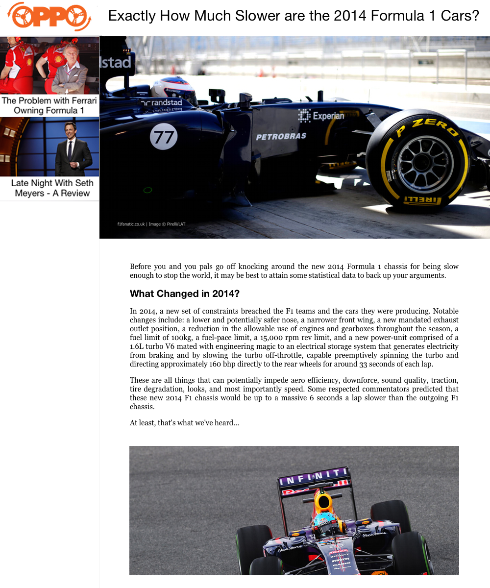
We've all had problems with Kinja since gawker introduced it, but here is my take on a new Kinja. This was done very quickly, so don't take it as a final and 100% iteration. Details below.
Heavily influenced by this !!!error: Indecipherable SUB-paragraph formatting!!! .
Left Side
Fixed
goes away for screens < 900px
width:20%
max-width:300px?
More articles filling out the left sidebar.
Main Content
width: 80%
text and other images width: 80% of Main Content
Main image width:100%
I didn't have the time to add in all of the menus, recommendations or the comments section.
Also, I work quite weird sometimes, so this probably won't look anything like what I would make actually coding it out and spending the time seeing how it works/reacts/looks.
 D
> Tim (Fractal Footwork)
04/21/2014 at 22:53 |
|
Kinja Redesign
Soon as I read these words I almost flipped this desk in front of me and jumped out of this sixth-story window
 DoctorDick
> Tim (Fractal Footwork)
04/21/2014 at 23:16 |
|
I work in web design and am often confused by kinja's strange design choices, but I realy like your design. The only part I disagree with is the gradient on the left, I think it would look better solid white. Oooh, brb I might do a mockup of my own for the fun of it.
 DoctorDick
> Tim (Fractal Footwork)
04/21/2014 at 23:32 |
|

Alright, here's my quick try. I just moved some stuff around in Photoshop. Re-sized the top bar, made the side bar images more flush, and added a light grey divider.
 Tim (Fractal Footwork)
> DoctorDick
04/21/2014 at 23:46 |
|
I worry about the separation between the article and the sidebar in your mockup, but I do agree that a solid light grey would work better
 DoctorDick
> Tim (Fractal Footwork)
04/21/2014 at 23:47 |
|
Damn. Your right, I didn't even notice that seperation as I was making it. It looks really weird.